Logo
Our logo is a symbol that identifies us. It holds different meaning for each person who views it. Using it consistently helps to create recognition for our brand. Subtle adjustments have been made to the previous logo version in order to keep it fresh and relevant.
USAGE OPTIONS
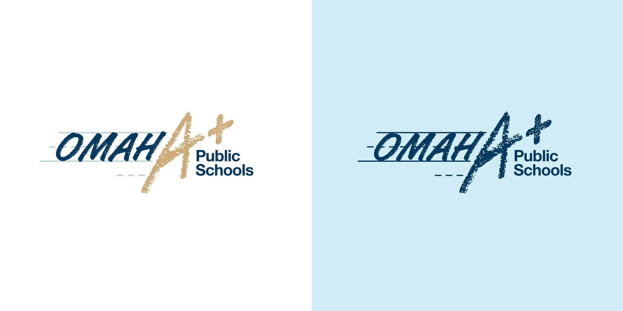
Here are the approved logo options that can be used in appropriate situations.
TAGLINE LOGO
The #OPSProud tagline logo should be used to complement other materials and does not replace the need for our Omaha Public Schools logo.
USAGE GUIDELINES
Our logo and logo elements should always be used in ways that uphold the integrity of the design and keep consistency.
DON'T stretch or scrunch.
DON'T rearrange the pieces.
DON'T switch out the colors.
DON'T change the fonts.
DON'T rotate.
DON'T place over complex backgrounds or photos.
DON'T crowd the logo.
Let the logo breathe by keeping space around it that is at least equal to the height of the “O” in Omaha.
DON'T use the logo too small.
In order to keep the logo legible and prominent, the minimum width in print should be 1"
DEPARTMENT LOGOS
Department logos have been created to provide a consistent format for all 17 departments. These logos are available upon request below.
CO-BRANDING WITH SCHOOLS
EQUAL PROMINENCE
Balance the logos visually so they feel equal in dominance. Divide the logos with a neutral gray line.
OPS EMPHASIS
The secondary logo should be approximately half the size of the emphasized logo.
OPS EMPHASIS LAYOUT
SCHOOL EMPHASIS
Use the dark blue, 1 color logo when OPS is secondary.


